TalayeSorkh | Visual Identity
Branding
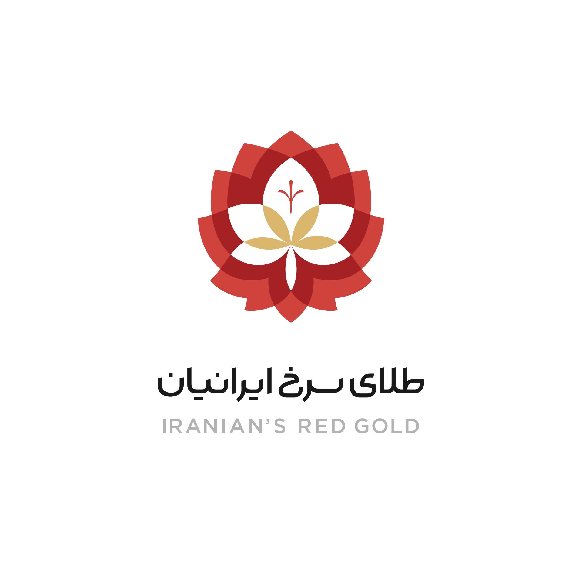
Iranian’s Red Gold is one of the largest company in area of producing, processing and selling Iranian Saffron in Middle East and rest of the world.
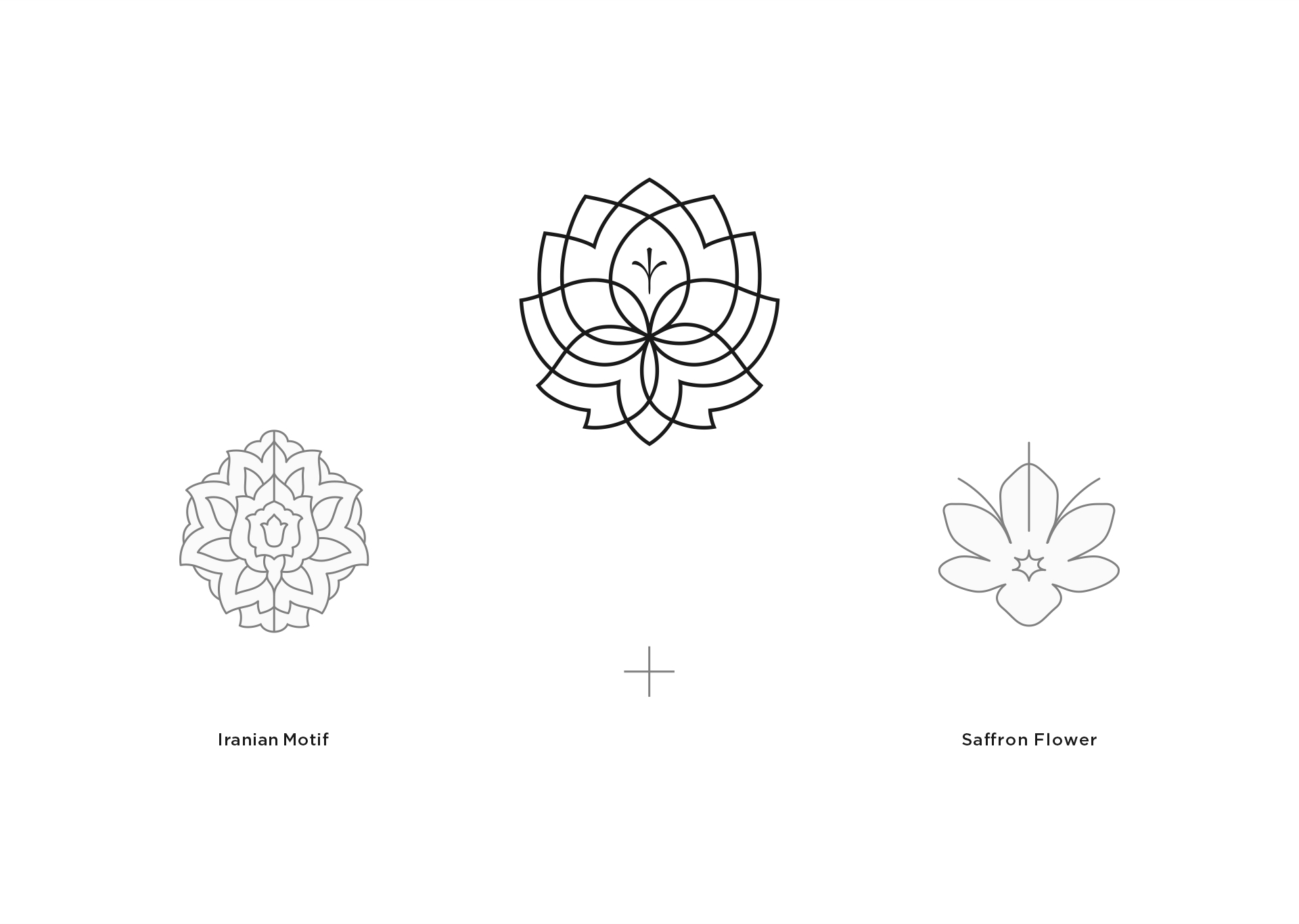
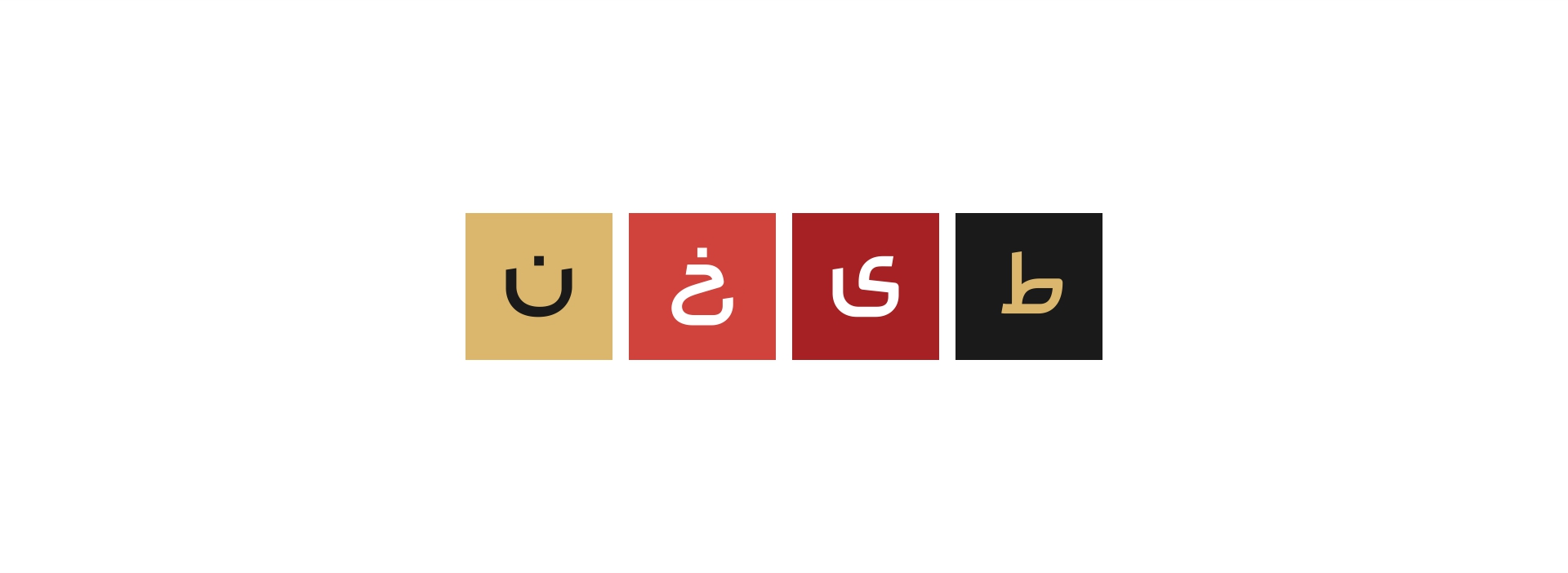
for designing the logo of this company we decided to take some inspiration from
two major indications in the brand’s name, The Saffron flower and a popular Iranian motif.
The Saffron flower is including five petals and the red stigmas in the center that considered smartly on the top of the design,
and we shaped the Iranian motif around the flower in a simpler form of usual, so at the end this mark will introducing
this valuable product and the Iranian origins at the same time.
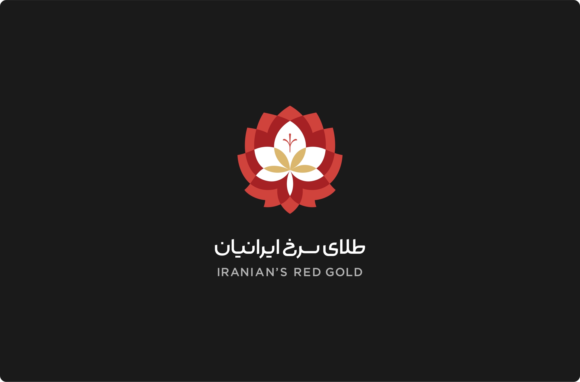
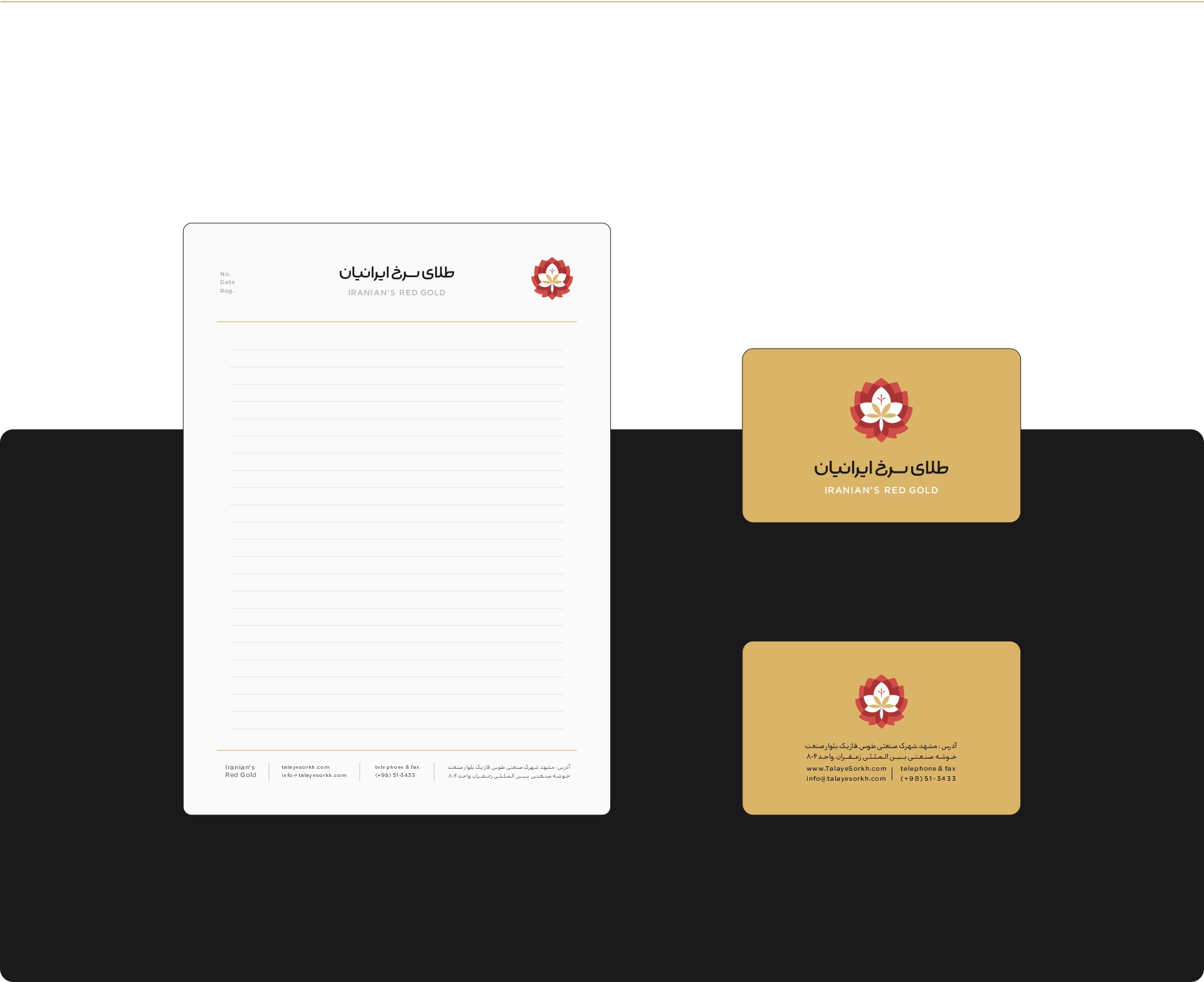
According to the area of activity of the company, we were required to use the two
Farsi and English languages for designing the logotype.
Farsi typography in almost twice the size of English type designed
at above in two layouts of horizontal and vertical for different use is different places.
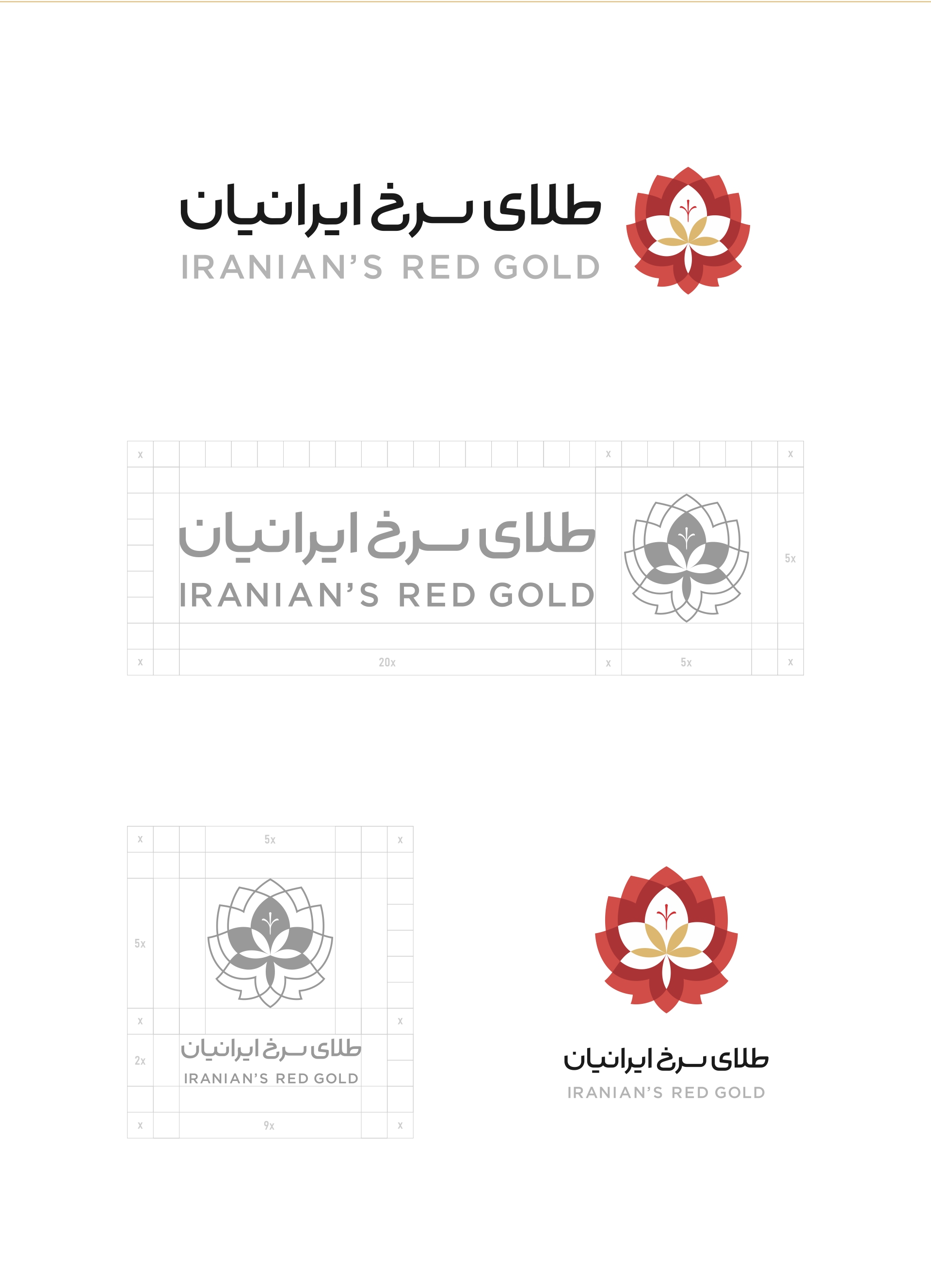
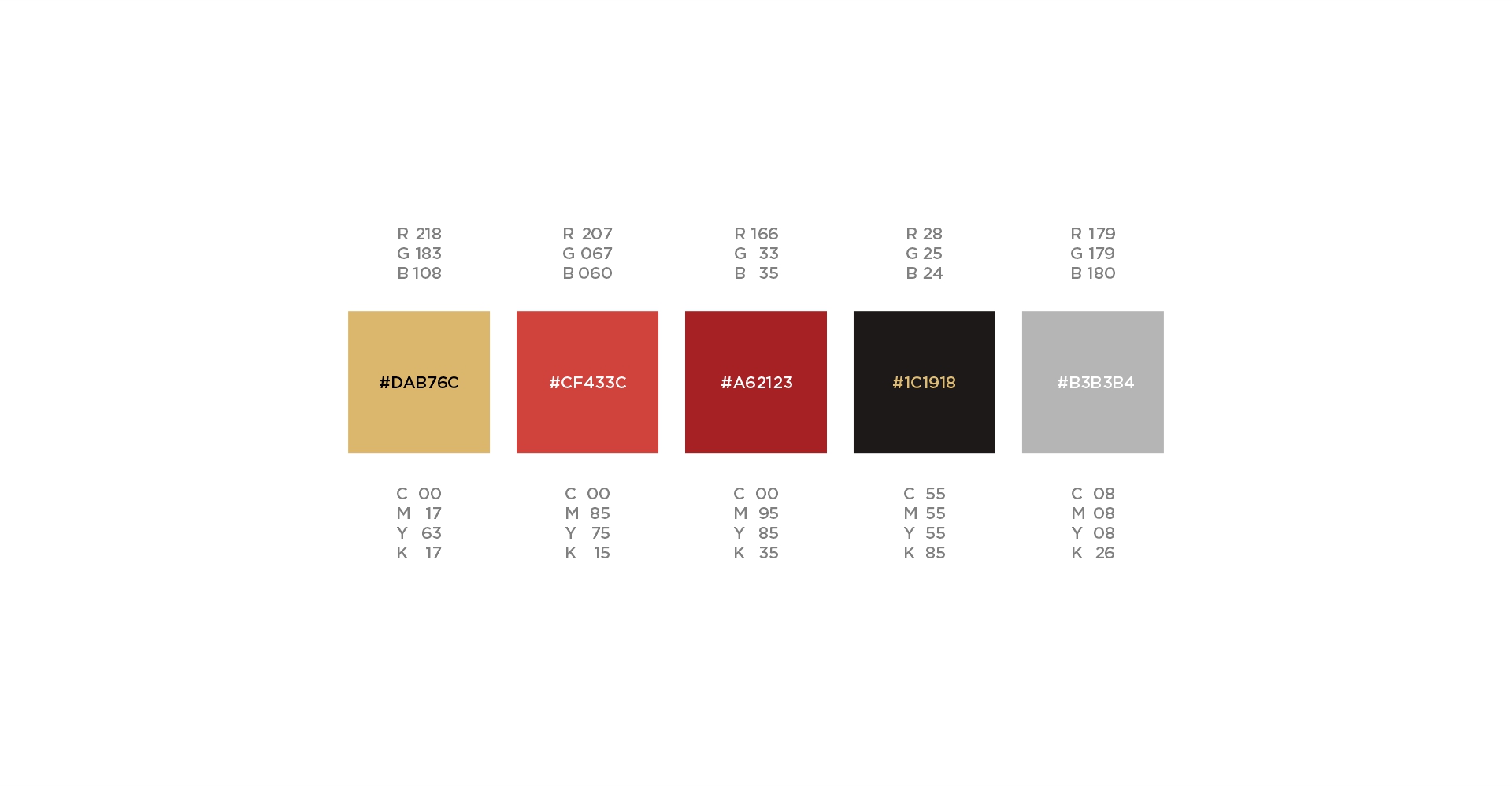
Colors in this Identity were selected by consulting with the company selling manager at the market and
considering the factors in the brand’s name. it’s obvious that the name has two color names in it!
So we pick a pallet and choose a sharp gold and a soft red and a darker red for the contrast,
and an unfilled black for the logotypes and a grey for slogans and subs.
This Visual Identity was designed in 2018